Joel Bowman, checking in today from Exaltación de la Cruz, Argentina...
Prices and earnings, earnings and prices.
Inflation was the watchword this week as the Labor Department released its much-anticipated consumer price index figures. (When did these things become so topical, by the way? That can’t be a good sign...)
In any case, US inflation came in at 6.5% over the 12 months to the end of December, said the feds, down from 7.1% in November.
That’s the sixth consecutive month that the pace of increase slowed and the smallest price increase in more than a year. Of course, not all prices are created equal. Some are “sticky,” while others are more “flexible.”
Dan has more on inflation... and Tom on what he’s doing about it... below. But first, let’s have a quick recap of the week in the markets.
America’s Big four banks reported earnings yesterday. A couple – JPMorgan Chase & Co and Bank of America Corp – beat quarterly estimates. Another couple – Wells Fargo & Co and Citigroup Inc – fell short. All four rose in trading Friday.
The Dow Jones closed slightly higher for the session, up 0.33%. The S&P 500 gained 0.4%, the Nasdaq 0.7%. The three major indexes were up 2%, 2.7% and 4.8% for the week, respectively.
Gold (about which more below) turned in a strong week, too. The Midas Metal was last seen trading for around $1,925/oz, up $125 for the month. Meanwhile, oil (WTI) was back over the $80 mark.
But back to the “sneaky tax,” inflation. That there’s a lot of confusion over what, exactly, is going on with consumer prices should not be surprising. Inflation is, after all, a strategy, a means by which the government – any government – can transfer wealth (measured in purchasing power) from those who earn money to those who create money.
“The most important thing to remember,” as Ludwig von Mises reminded us in his essay Economic Policy: Thoughts for Today and Tomorrow, “is that inflation is not an act of God, that inflation is not a catastrophe of the elements or a disease that comes like the plague. Inflation is a policy.”
Rising prices are but a symptom of such policy. And, as mentioned above, not all prices rise at the same rate or in the same way.
Dan explained the difference between “sticky” and “flexible” prices, and what it means for the future of the fed’s favorite policy, in yesterday’s update to paid members. Here’s a key snippet:
In Friday’s letter Bill Bonner mentioned that more detailed research from the Fed looks at ‘flexible’ prices and ‘sticky prices.’ Flexible prices, like food and energy, are volatile. They’re not ‘forward looking’ in the sense that they don’t tell you much about people’s inflation expectations. Egg prices are through the roof now. But most people expect them to come down in a few weeks or months.
Sticky prices are different, as you can see on the chart below. They are less volatile and more forward looking, which makes sense. They tell you more about future inflation AND inflation expectations. Sticky prices are things like medical services, educational costs for your kids, and rent or shelter. The higher those go (and stay), the more entrenched inflation expectations are. Now look at the chart.
(Source: US Federal Reserve)
‘Sticky prices’ are rising at a 6.6% annual rate, according to the chart above. It’s an interesting chart, too, isn’t it? Interest rates were low for forty years but didn’t result in inflation in sticky prices. It wasn’t until the broad money supply blew up with Covid spending in 2020 that sticky price inflation took off.
It’s also worth pointing out that sticky price history shows the same Fed mistake in the 1970s I’ve written about before with headline CPI. Prices came down after the 1974 recession and the Fed cut rates. But it was too soon. They went right back up and the Fed was forced to reverse course and raise rates to crush inflation.
Policy and psychology. They’re now related in a way that markets and the Fed can’t quite understand or predict. Investors–who made a mint during the asset price inflation of the last forty years (and especially from 2020 to 2021)- would like to believe inflation has been defeated and the Fed’s terminal rate is 5%, then back to the good old days.
A deeper dive into services inflation says otherwise. And if the Fed is reading from its ‘70s playbook, it will be reluctant to say or do anything that could lead to a new surge in either flexible or sticky prices.
Eventually, there WILL be a pivot or even more QE. When higher interest rates result in foreclosures, bankruptcies, and insolvencies, those are the events that lead to a more systemic crisis, the kind the Fed wants to prevent. If Tom’s right, 2023 is the year we begin to see that.
As for what to do in case price inflation does hang around, or remain “higher for longer,” as some have suggested? Historically, gold has been seen as the anti-inflation hedge, a way to preserve purchasing power over time while fiat money melts away.
Unsurprising, then, that gold should be marching higher... and that Bonner Private Research’s investment director, Tom Dyson, should be paying close attention to it.
Here’s Tom, with some remarks from last Wednesday’s research note to members...
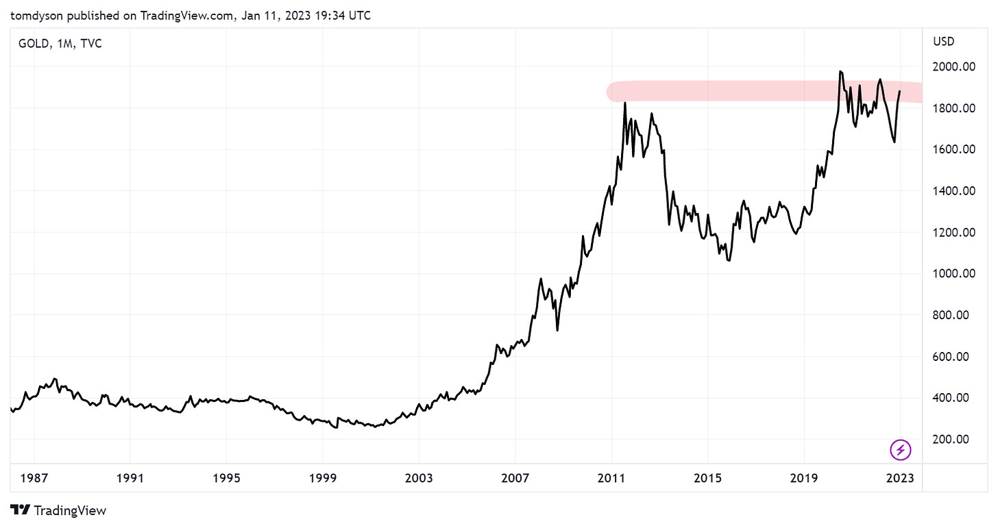
Gold is interesting now because it has reached this price level (near $2,000) four times in the last three years but has been unable to break through it decisively. It’s a key price level because $1,909 was the all time high price set in 2011 and gold has been trying to exceed that since 2019.
When I see a chart knocking on a resistance level like this, I know it will eventually break through and go higher. The “knocks” are just a series of distributions from weak hands to strong hands. Gold is now pressing up to the $1,909 level again. Will this be the time it breaks through for good? Or will it just prise out more ounces onto the market and move them from weak hands into strong hands in another distribution?
I have no idea. But I can say this. I’m one of the strong hands. I couldn’t even sell my gold if I wanted to. Encased in cement and sitting at the bottom of a lake is how I like to store my gold. The question is, should we be buying more?
If you’re looking to follow along with Dan’s macro research and Tom’s investment strategy, you can start by finding a subscription plan that works for you, here...
Join us again tomorrow, for your usual Sunday Session, when we’ll take a closer look at the nature of history and how its cycles – great and small – impact our life here on this pale blue dot.
Meanwhile, we’re off to throw a couple of tomahawk steaks on the grill. As you can see here, it’s quite a day for it out here in the countryside...
(A Francis Mallmann-style grill at our friend’s campo house, about an hour outside of the capital, here in Argentina.)
We’ll let you know how they go.
Until tomorrow...
Cheers,
Joel Bowman
Thank you for reading Bonner Private Research. This post is public, so feel free to share it with carnivores and herbivores alike...
My vote is to lose the new font used in the email messages. It has an Old School appeal and is easy to read on the printed page, but it’s murderously hard to read on the electronic page. My two cents’ worth...
The new font looked good at first but on comparing the 2, the old font is much easier to read. I only use my phone for reading, notherwise computer so not sure about there.
So my vote is for the original font.
And thanks for your writing Joel, always enjoy.
(Just researching the Mallmann grill, not available in Australia but his book is! Looks good)