
Silver Bells
Silver’s historic rise today–which all of us long-suffering silver bulls should celebrate–is also a warning that something is breaking in the system of the world.
Friday, December 26th, 2025
Laramie, Wyoming
By Dan Denning
We interrupt this regularly scheduled holiday vacation to say…wow. What was that all about?
In case you missed it, silver was up by more than 10% today. Under normal conditions, this kind of event is statistically rare….and extreme. It just doesn’t happen very often. And when it does, it typically means something dramatic, destructive, or shocking has happened in markets (technically, this was a 4-5 sigma event for silver today).
I turned on the TV after the market closed and did not see anything blowing up (unless you count precious metals). It started last night in China when the futures price approached US$80/ounce. When the futures opened in the US, they were at $72.73/ounce. Last I checked, they were $79.60/ounce.
You don’t see that everyday. Even accounting for thin holiday trading volumes and small open interest in the paper markets, it’s a historical move. So what now?
If only we knew! But let’s look at a few ‘big picture’ charts as we head into the weekend. And then a final comment about food.
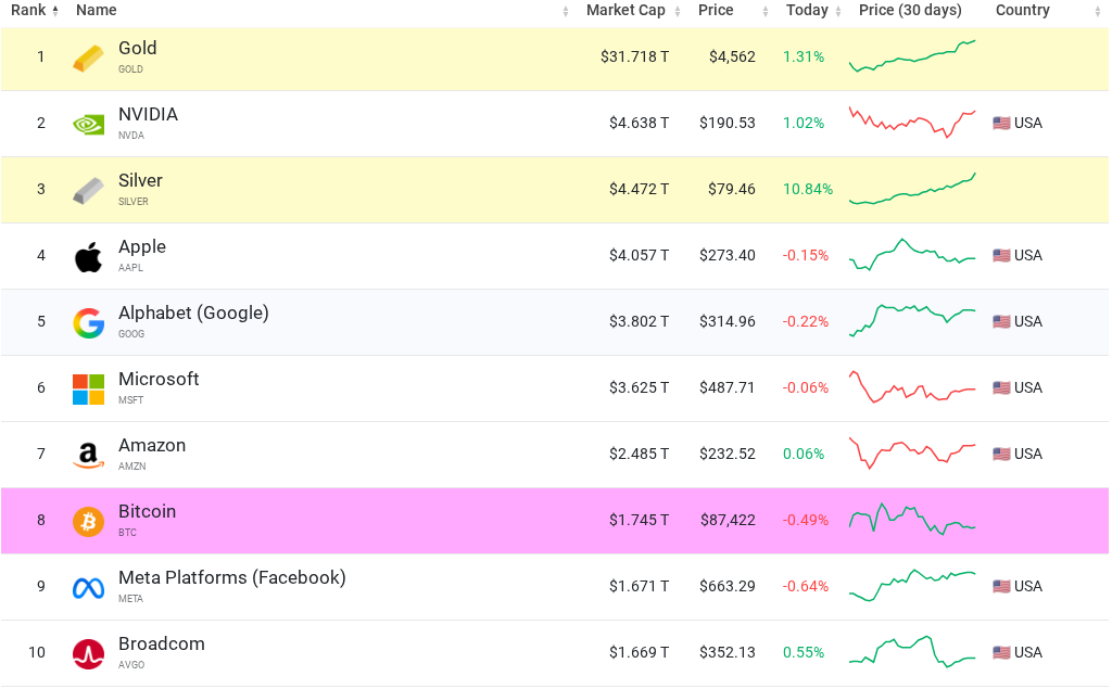
Silver is now a $4.4 trillion asset. It sits just behind gold and Nvidia and just ahead of the rest of the Mag 7 and Bitcoin. But the market value of the known investable silver market doesn’t tell the whole story.
You’d think the miners would be throwing off wads of free cash flow at these prices. Energy prices are low. Metals prices are high. Setting aside the fact that most silver is a by-product of mining for other metals, we haven’t seen a correspondingly large move in the mining stocks.
Yet.
That tells me that silver is still ‘underowned’ by professional and retail investors. They just don’t believe the story. Or they’d never heard of it or taken it seriously. Until this week…and until today. It’s impossible to miss now.
This kind of price action is going to attract a lot of new blood to the bandwagon. Many of these new hands will have no idea about the supply deficit in silver, its placement on the ‘critical minerals’ list earlier this year by the US government, or that lower interests rates and quantitative easing (QE) in 2026 will send more liquidity flooding into the market (and real assets, if we’re right).
But that raises the question of exactly where we’re at now in the precious metals bull market. Is this the kind of move you see at a ‘blow off’ top? Should we be thinking of taking profits or tightening stops in platinum and silver? What does gold have to say? Let’s look at the next chart.
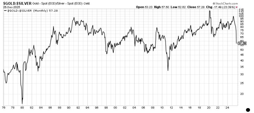
This is the gold/silver ratio going back fifty years (the price of one ounce of gold divided by the price of one ounce of silver). Gold is up 72% this year (in US dollar terms). Silver is up 172% (also in US dollar terms). Both are up. But silver is up more lately, and catching up with gold. From here?
Well, we can set aside (for now) the issue of where the price is being set. It’s an important issue. If the paper markets in the West are broken and the price is being set in the East by physical buyers, then you would see much higher silver prices in 2026. I’ve seen forecasts as high as $100/ounce based on some of the factors above (supply deficit, industrial demand, and investment demand to name a few).
But using the ratio above, you would not be wrong if you said silver was fairly valued in gold terms. Today’s move brought the ratio to 57. That’s around the middle of the distribution going back 50 years (what Alyosha calls the Point of Control). The ratio DID go lower in 2011. But that was near the end of the bull market in precious metals.
I’m not saying the ratio won’t go lower…or silver much higher. But please buckle up for volatility. It would be hard to over-state how extraordinary today’s price action was. There will be a correction at some point. What else should we keep an eye on in the meantime? See below.
Take a good look at a gold chart from April to September of this year. It didn’t do much. The price was range bound and lethargic until the big breakout in the fall. Now keep that in mind when you look at the chart above.
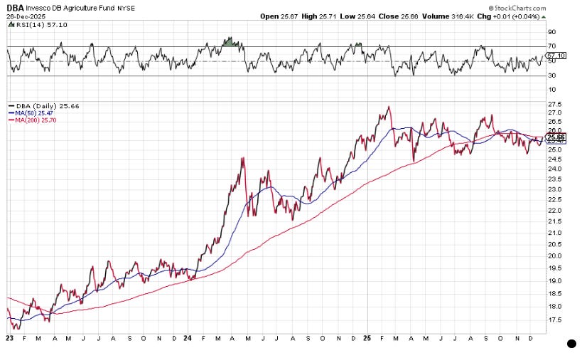
Tom and I have both mentioned DBA before. It’s an Invesco DB Agriculture Fund, an exchange traded fund that tracks agricultural commodities (and holds them through the futures market). It tracks the performance of Grains (Corn, Soybeans, Wheat, Kansas City Wheat), Softs (Sugar, Coffee, Cocoa, Cotton) and Livestock (Live Cattle, Feeder Cattle, Lean Hogs).
DBA has been range bound this year as well. But you’re seeing a convergence with the share price and the 50-day and 200-day moving average. It looks like a coiled spring. What next?
